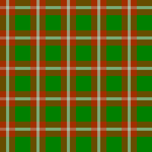
CSS3 Patterns

Gray Rings CSS3 Background Pattern

You can download the pattern or use the CSS3 code below (you can copy the text). body { /* CSS3 pattern provided by JonesPatterns.com */ background-image: radial-gradient(circle,white 0%,#bbb 2%,white 5%,white 10%,#aaa 12%,white 15%,white 20%,#bbb 22%,white 25%,white 30%,#aaa 32%,white 35%,white 40%,#bbb 42%,white 45%,white 50%,#aaa 52%,white 55%,white 60%,#bbb 62%,white 65%); background-image: -webkit-radial-gradient(circle,white 0%,#bbb 2%,white 5%,white 10%,#aaa 12%,white Gray Rings CSS3 Background Pattern

Get Pattern

Gray Rings CSS3 Background Pattern

You can download the pattern or use the CSS3 code below (you can copy the text).

body {
/* CSS3 pattern provided by JonesPatterns.com */
background-image: radial-gradient(circle,white 0%,#bbb 2%,white 5%,white 10%,#aaa 12%,white 15%,white 20%,#bbb 22%,white 25%,white 30%,#aaa 32%,white 35%,white 40%,#bbb 42%,white 45%,white 50%,#aaa 52%,white 55%,white 60%,#bbb 62%,white 65%);
background-image: -webkit-radial-gradient(circle,white 0%,#bbb 2%,white 5%,white 10%,#aaa 12%,white 15%,white 20%,#bbb 22%,white 25%,white 30%,#aaa 32%,white 35%,white 40%,#bbb 42%,white 45%,white 50%,#aaa 52%,white 55%,white 60%,#bbb 62%,white 65%);
background-image: -o-radial-gradient(circle,white 0%,#bbb 2%,white 5%,white 10%,#aaa 12%,white 15%,white 20%,#bbb 22%,white 25%,white 30%,#aaa 32%,white 35%,white 40%,#bbb 42%,white 45%,white 50%,#aaa 52%,white 55%,white 60%,#bbb 62%,white 65%);
background-size: 100px 100px;
background-color: #fff;
}

Pink Diamond CSS3 Background Pattern

You can download the pattern or use the CSS3 code below (you can copy the text). body{ /* CSS3 pattern provided by JonesPatterns.com */ background-image: -moz-linear-gradient(135deg,#f77 25%,transparent 25%), -moz-linear-gradient(45deg,#faa 25%,transparent 25%), -moz-linear-gradient(135deg,transparent 75%,#f66 75%), -moz-linear-gradient(45deg,#800 75%,#f44 75%); background-image: -o-linear-gradient(135deg,#f77 25%,transparent 25%), -o-linear-gradient(45deg,#faa 25%,transparent 25%), -o-linear-gradient(135deg,transparent 75%,#f66 75%), -o-linear-gradient(45deg,#800 75%,#f44 75%); background-image: -webkit-linear-gradient(135deg,#f77 25%,transparent 25%), -webkit-linear-gradient(45deg,#faa Pink Diamond CSS3 Background Pattern

Get Pattern

Pink Diamond CSS3 Background Pattern

You can download the pattern or use the CSS3 code below (you can copy the text).

body{
/* CSS3 pattern provided by JonesPatterns.com */
background-image:
-moz-linear-gradient(135deg,#f77 25%,transparent 25%),
-moz-linear-gradient(45deg,#faa 25%,transparent 25%),
-moz-linear-gradient(135deg,transparent 75%,#f66 75%),
-moz-linear-gradient(45deg,#800 75%,#f44 75%);
background-image:
-o-linear-gradient(135deg,#f77 25%,transparent 25%),
-o-linear-gradient(45deg,#faa 25%,transparent 25%),
-o-linear-gradient(135deg,transparent 75%,#f66 75%),
-o-linear-gradient(45deg,#800 75%,#f44 75%);
background-image:
-webkit-linear-gradient(135deg,#f77 25%,transparent 25%),
-webkit-linear-gradient(45deg,#faa 25%,transparent 25%),
-webkit-linear-gradient(135deg,transparent 75%,#f66 75%),
-webkit-linear-gradient(45deg,#800 75%,#f44 75%);
background-image:
linear-gradient(135deg,#f77 25%,transparent 25%),
linear-gradient(45deg,#faa 25%,transparent 25%),
linear-gradient(135deg,transparent 75%,#f66 75%),
linear-gradient(45deg,#800 75%,#f44 75%);
background-size:40px 40px;
background-color: #fff;
}

Red Stripe CSS3 Background Pattern

You can download the pattern or use the CSS3 code below (you can copy the text).body { /* CSS3 pattern provided by JonesPatterns.com */ background-image: linear-gradient(90deg,#880000 50%,transparent 50%); background-image: -webkit-linear-gradient(0deg,#880000 50%,transparent 50%); background-image: -o-linear-gradient(90deg,#880000 50%,transparent 50%); background-color:red; background-size: 50px 50px; }

Get Pattern

Red Stripe CSS3 Background Pattern

You can download the pattern or use the CSS3 code below (you can copy the text).
body {
/* CSS3 pattern provided by JonesPatterns.com */
background-image: linear-gradient(90deg,#880000 50%,transparent 50%);
background-image: -webkit-linear-gradient(0deg,#880000 50%,transparent 50%);
background-image: -o-linear-gradient(90deg,#880000 50%,transparent 50%);
background-color:red;
background-size: 50px 50px;
}

Polka Dot CSS3 Background Pattern

You can download the pattern or use the CSS3 code below (you can copy the text).body{ /* CSS3 pattern provided by JonesPatterns.com */ background-image: radial-gradient(circle,#f88 5px,transparent 0px), radial-gradient(circle,#fcf 5px, transparent 0px); background-image: -o-radial-gradient(circle,#f88 5px,transparent 0px), -o-radial-gradient(circle,#fcf 5px, transparent 0px); background-image: -webkit-radial-gradient(circle,#f88 5px,transparent 0px), -webkit-radial-gradient(circle,#fcf 5px, transparent 0px); background-size: 25px 25px; background-position: 12px 12px,0px 0px; background-color: Polka Dot CSS3 Background Pattern

Get Pattern

Polka Dot CSS3 Background Pattern

You can download the pattern or use the CSS3 code below (you can copy the text).
body{
/* CSS3 pattern provided by JonesPatterns.com */
background-image:
radial-gradient(circle,#f88 5px,transparent 0px),
radial-gradient(circle,#fcf 5px, transparent 0px);
background-image:
-o-radial-gradient(circle,#f88 5px,transparent 0px),
-o-radial-gradient(circle,#fcf 5px, transparent 0px);
background-image:
-webkit-radial-gradient(circle,#f88 5px,transparent 0px),
-webkit-radial-gradient(circle,#fcf 5px, transparent 0px);
background-size: 25px 25px;
background-position: 12px 12px,0px 0px;
background-color: #ffffff;
}

Orange Chevron CSS3 Background Pattern

You can download the pattern or use the CSS3 code below (you can copy the text). body{ /* CSS3 pattern provided by JonesPatterns.com */ background-image: -moz-linear-gradient(-120deg, #f90 30px, transparent 30px), -moz-linear-gradient(-60deg, #f90 30px, transparent 30px), -moz-linear-gradient(-120deg, #fc0 60px, transparent 60px), -moz-linear-gradient(-60deg, #fc0 60px, transparent 60px), -moz-linear-gradient(-120deg, #f90 70px, transparent 70px), -moz-linear-gradient(-60deg, #f90 70px, transparent 70px), Orange Chevron CSS3 Background Pattern

Get Pattern

You can download the pattern or use the CSS3 code below (you can copy the text).

body{
/* CSS3 pattern provided by JonesPatterns.com */
background-image:
-moz-linear-gradient(-120deg, #f90 30px, transparent 30px),
-moz-linear-gradient(-60deg, #f90 30px, transparent 30px),
-moz-linear-gradient(-120deg, #fc0 60px, transparent 60px),
-moz-linear-gradient(-60deg, #fc0 60px, transparent 60px),
-moz-linear-gradient(-120deg, #f90 70px, transparent 70px),
-moz-linear-gradient(-60deg, #f90 70px, transparent 70px),
-moz-linear-gradient(-120deg, #ff0 80px, transparent 80px),
-moz-linear-gradient(-60deg, #ff0 80px, #f90 80px);
background-image:
-o-linear-gradient(-120deg, #f90 30px, transparent 30px),
-o-linear-gradient(-60deg, #f90 30px, transparent 30px),
-o-linear-gradient(-120deg, #fc0 60px, transparent 60px),
-o-linear-gradient(-60deg, #fc0 60px, transparent 60px),
-o-linear-gradient(-120deg, #f90 70px, transparent 70px),
-o-linear-gradient(-60deg, #f90 70px, transparent 70px),
-o-linear-gradient(-120deg, #ff0 80px, transparent 80px),
-o-linear-gradient(-60deg, #ff0 80px, #f90 80px);
background-image:
-webkit-linear-gradient(-120deg, #f90 30px, transparent 30px),
-webkit-linear-gradient(-60deg, #f90 30px, transparent 30px),
-webkit-linear-gradient(-120deg, #fc0 60px, transparent 60px),
-webkit-linear-gradient(-60deg, #fc0 60px, transparent 60px),
-webkit-linear-gradient(-120deg, #f90 70px, transparent 70px),
-webkit-linear-gradient(-60deg, #f90 70px, transparent 70px),
-webkit-linear-gradient(-120deg, #ff0 80px, transparent 80px),
-webkit-linear-gradient(-60deg, #ff0 80px, #f90 80px);
background-image:
linear-gradient(210deg, #f90 30px, transparent 30px),
linear-gradient(150deg, #f90 30px, transparent 30px),
linear-gradient(210deg, #fc0 60px, transparent 60px),
linear-gradient(150deg, #fc0 60px, transparent 60px),
linear-gradient(210deg, #f90 70px, transparent 70px),
linear-gradient(150deg, #f90 70px, transparent 70px),
linear-gradient(210deg, #ff0 80px, transparent 80px),
linear-gradient(150deg, #ff0 80px, #f90 80px);
background-size: 80px 100px;
}