Skip to the content
Jones Patterns
Free unique background patterns
About
How To
License
Privacy Policy
Support
Welcome
Search for:
Search by Color
beige
black
blue
brown
burgundy
gray
green
magenta
multicolor
orange
pink
purple
red
tan
teal
white
yellow
Search by Theme
holiday
food
geometric
seasonal
nature
fantasy
lines
animal
cute
plaid
argyle
sports
subtle
Search by Format
PNG
JPG
Transparent PNG
SVG Vector
Animated GIF
CSS3
Random Post
red Patterns
red white and blue plaid
Get Pattern
Fire Scale Pattern
Get Pattern
Raining Hearts Pattern
Get Pattern
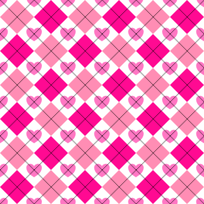
red and pink argyle and heart pattern
Get Pattern
Pink Smiling Heart Transparent PNG
Get Pattern
Pink Smiling Heart Pattern
Get Pattern
red and pink 3d square pattern
Get Pattern
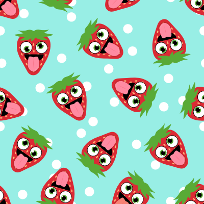
Silly Strawberry Pattern
Get Pattern
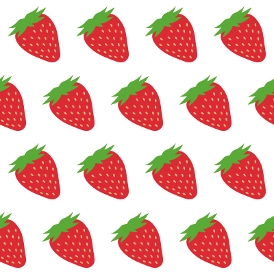
strawberry transparent png pattern
Get Pattern
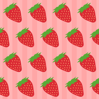
strawberry and stripes pattern
Get Pattern
1
2
3
…
7
Next »
Facebook
Twitter
LinkedIn
Tumblr
Email
0
Shares


