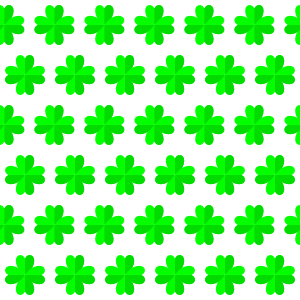
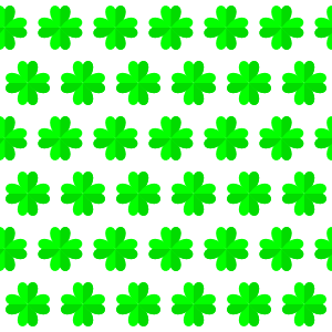
green Patterns

CSS3 red and green plaid pattern
You can download the pattern or use the CSS3 code below (you can copy the text).body { /* CSS3 pattern provided by JonesPatterns.com */ background-image: linear-gradient(90deg, rgba(255,0,0,.4) 0%, rgba(255,0,0,.4) 20%, rgba(200,200,200,.6) 20%, rgba(200,200,200,.6) 30%, rgba(255,0,0,.4) 30%, rgba(255,0,0,.4) 50%, transparent 50%), linear-gradient(180deg, rgba(255,0,0,.4) 0%, rgba(255,0,0,.4) 20%, rgba(200,200,200,.6) 20%, rgba(200,200,200,.6) 30%, rgba(255,0,0,.4) 30%, rgba(255,0,0,.4) 50%, transparent 50%); … CSS3 red and green plaid pattern
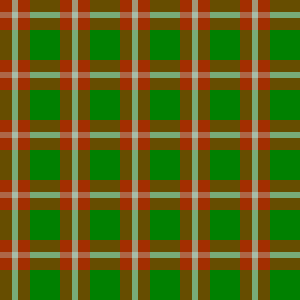
You can download the pattern or use the CSS3 code below (you can copy the text).
body {

/* CSS3 pattern provided by JonesPatterns.com */

background-image:

	linear-gradient(90deg, rgba(255,0,0,.4) 0%, rgba(255,0,0,.4) 20%, rgba(200,200,200,.6) 20%, rgba(200,200,200,.6) 30%, rgba(255,0,0,.4) 30%, rgba(255,0,0,.4) 50%, transparent 50%),

	linear-gradient(180deg, rgba(255,0,0,.4) 0%, rgba(255,0,0,.4) 20%, rgba(200,200,200,.6) 20%, rgba(200,200,200,.6) 30%, rgba(255,0,0,.4) 30%, rgba(255,0,0,.4) 50%, transparent 50%);

background-color: green;

background-size: 60px 60px;

}
CSS3 green square pattern
You can download the pattern or use the CSS3 code below (you can copy the text).body { /* CSS3 pattern provided by JonesPatterns.com */ background-image: linear-gradient(90deg, white 50%, #859020 47%, transparent 50%), linear-gradient(180deg, white 50%, transparent 53%); background-color: #859020; background-size: 60px 60px; }

You can download the pattern or use the CSS3 code below (you can copy the text).
body {

/* CSS3 pattern provided by JonesPatterns.com */

background-image:

    linear-gradient(90deg, white 50%, #859020 47%, transparent 50%),

    linear-gradient(180deg, white 50%, transparent 53%);

background-color: #859020;

background-size: 60px 60px;

}